Product Tiles: the Shop's component system
A unified product tile system, born out of NerdWallet's Shop redesign and refined through A/B tests on visual details on Lyssna.
- Role
- Senior Product Designer
- Timeline
- Platform
- Mobile (iOS + Android)
- Team
- Senior Product Designer, Product Manager, Engineering, Design System team
Overview
During NerdWallet's Shop redesign, the product tile turned out to be too complex to resolve inside the main project's flow: it had to support multiple product types, advertiser disclosure compliance states, and content variations, all while keeping a single visual language. This project documents the process of turning the tile into its own component system, from the initial brainstorming session through A/B tests on color, font, spacing, and hierarchy on Lyssna, to a complete hi-fi flow with engineering handoff.
1. Problem Identified
This project grew out of the brainstorming and ideation phase of NerdWallet's Shop redesign. While mapping the Shop's problems as a whole, it became clear that the product tile carried a disproportionate share of the complexity on its own: it had to support multiple product types (credit card, banking, and a generic format for future expansion), advertiser disclosure compliance states, and several content variations, all while keeping one consistent visual language. Given that, we pulled the tile out of the main redesign's flow and treated it as its own workstream, with dedicated time and testing.
2. Brainstorming Session
To understand the tile's specific pain points and generate solution hypotheses, I ran a brainstorming session with the team. The goal was to map where the current component was falling short, things like inconsistent layouts between credit card, banking, and loan tiles, disclosure treated as an overlaid element instead of a structural part of the tile, and the lack of a shared spacing and typography token system, and to surface possible directions before any design work started.
3. Lo-Fi Improvements and A/B Testing on Lyssna
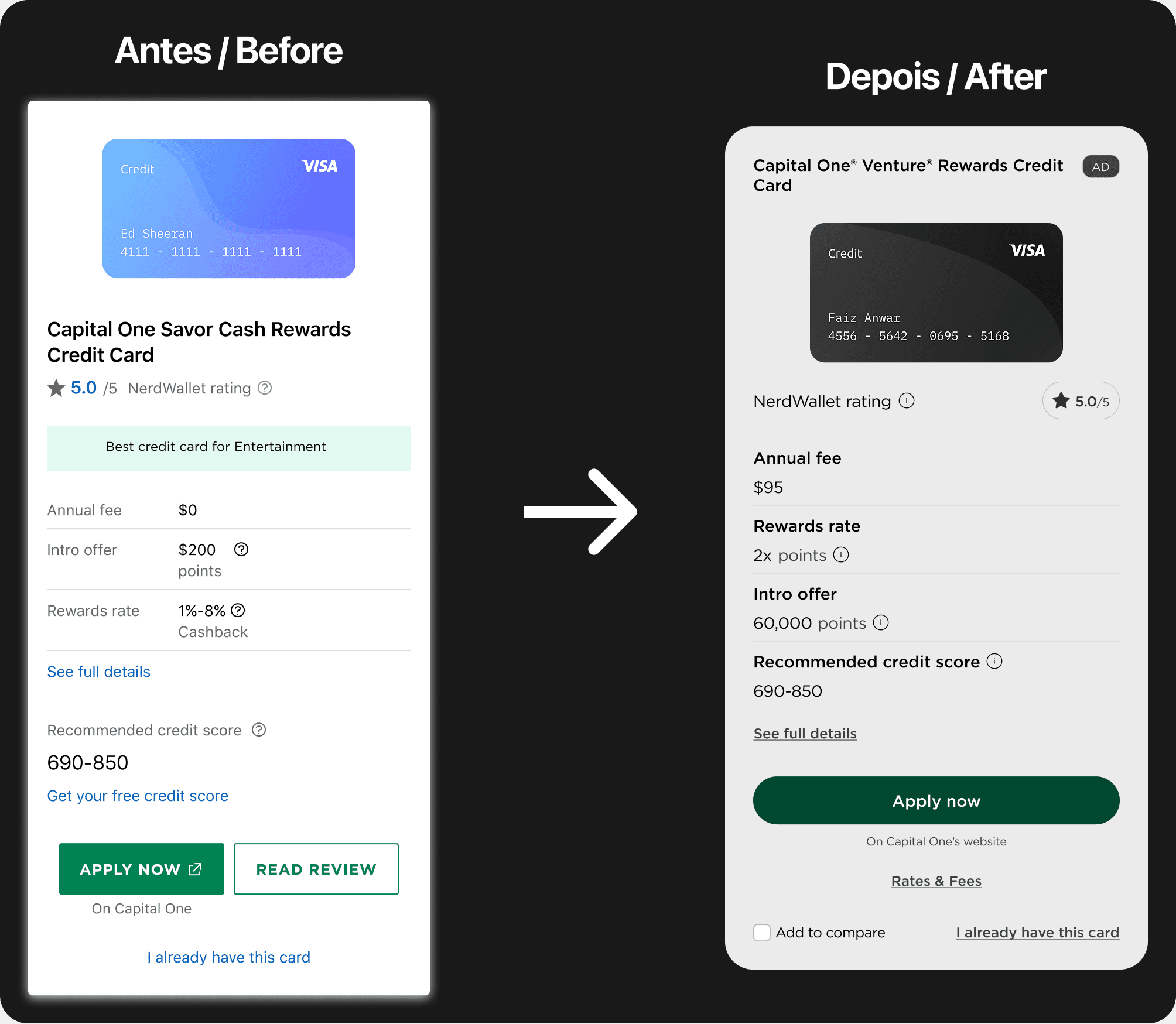
With hypotheses in hand, I moved into lo-fis testing variations of color, font, size, spacing, and hierarchy within the tile itself. Each variation was validated through A/B tests on Lyssna, comparing two or more versions side by side to settle each direction with real user data instead of internal preference. That round of testing answered very concrete questions: which type weight made the annual fee and rewards rate more legible without competing with the product name and the NerdWallet Rating score, how much spacing between attribute rows (annual fee, rewards rate, welcome offer, recommended credit score) helped or hurt quick scanning, and how the advertiser disclosure badge ("AD") should behave visually to stay noticeable without competing with the "Apply now" CTA and the "Add to compare" checkbox.
4. Hi-Fi Flow and Handoff
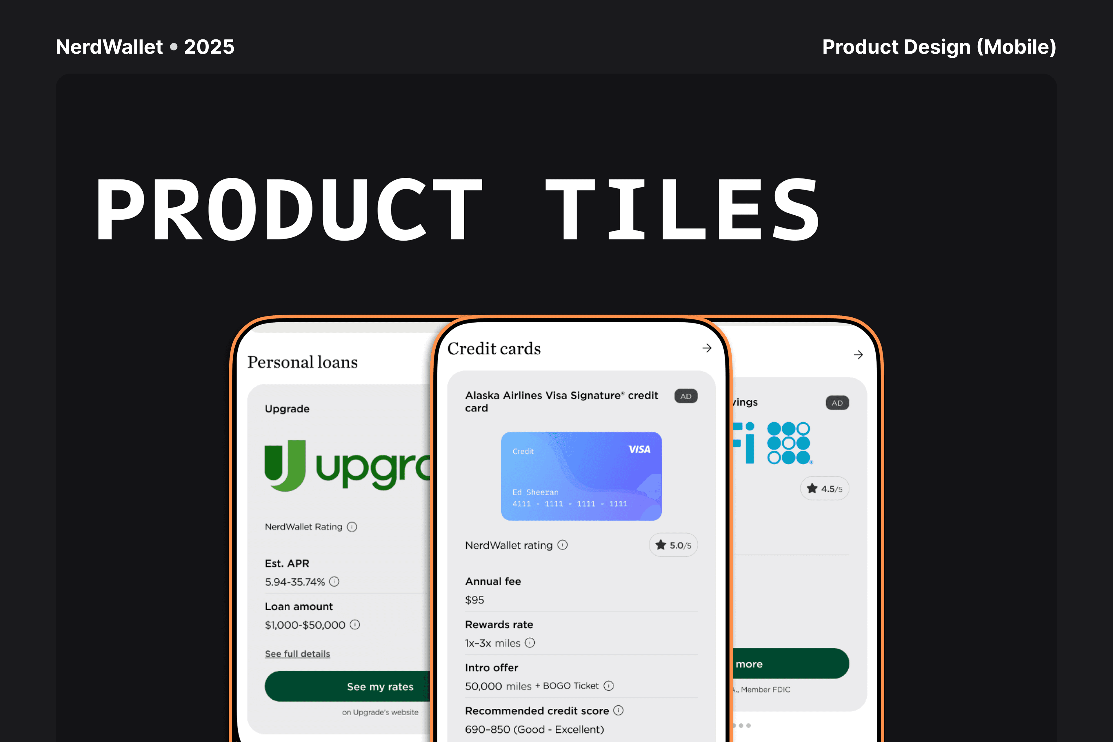
With the lo-fi decisions validated, I designed the complete hi-fi flow for the tile system: the three product-type variants (CC, Banking, and generic), the four states for each (default, pressed, loading, and unavailable), and the two advertiser disclosure variants integrated structurally into the component (NE, non-expandable, and RC, reduced/collapsible). On the CC tile, the final content included the product name, disclosure badge, NerdWallet Rating in stars, annual fee, rewards rate, welcome offer, recommended credit score, a "See full details" link, an "Apply now" CTA, and the "Add to compare" checkbox, validated with real cards like the Alaska Airlines Visa Signature® and the World of Hyatt Credit Card. On the Banking tile, the pattern was leaner, with product name, disclosure badge, rating, APY, minimum balance to earn that APY, and monthly fee, tested with products like SoFi Checking and Savings. Both carousels also got a fixed closing card, "Explore all," inviting users to see the full product list for that category.
At handoff, I delivered complete spacing and typography token documentation to engineering, along with behavior annotations for every state and variant, so the system could be implemented consistently across the Shop's L1 and L2.
5. Results
This project never had an isolated impact metric of its own, because it was always part of a larger project: the full Shop redesign. It was the Shop Redesign, not the tile system on its own, that had its results measured and shared publicly, including a 176% increase in revenue per session and a 174% jump in weekly Shop tab revenue, among other numbers. The tile is a central component within that larger result, but isolating its individual contribution wouldn't be a reliable number, since it shipped together with every other L1 and L2 change in the same release.
6. Learnings
Splitting the tile into its own workstream was worth it even without an isolated metric. Testing visual details in isolation, things like color, spacing, and hierarchy, brought a level of precision that would have been hard to reach inside the broader pace of the full redesign. Validating piece by piece on Lyssna, instead of only testing the full screen, avoided guesswork on small elements that, multiplied across hundreds of thousands of impressions, carried real weight in the final result.
It also became clear that treating advertiser disclosure as a structural part of the tile, rather than an overlaid element, simplified handoff considerably and reduced ambiguity for engineering.
The biggest lesson, though, was about metric expectations: not every design project needs, or is able to, produce a number of its own. Sometimes a component's value shows up in the result of the whole system, and that's fine to lean on when the work genuinely functions that way.