Shop Redesign
I redesigned the financial product marketplace inside NerdWallet's app, iterating across six releases until shipping a complete L1 and L2 overhaul at scale.
- Role
- Senior Product Designer
- Timeline
- 2025
- Platform
- Mobile (iOS + Android)
- Team
- Senior Product Designer, Product Manager, Engineering, Design System team, Marketing
Overview
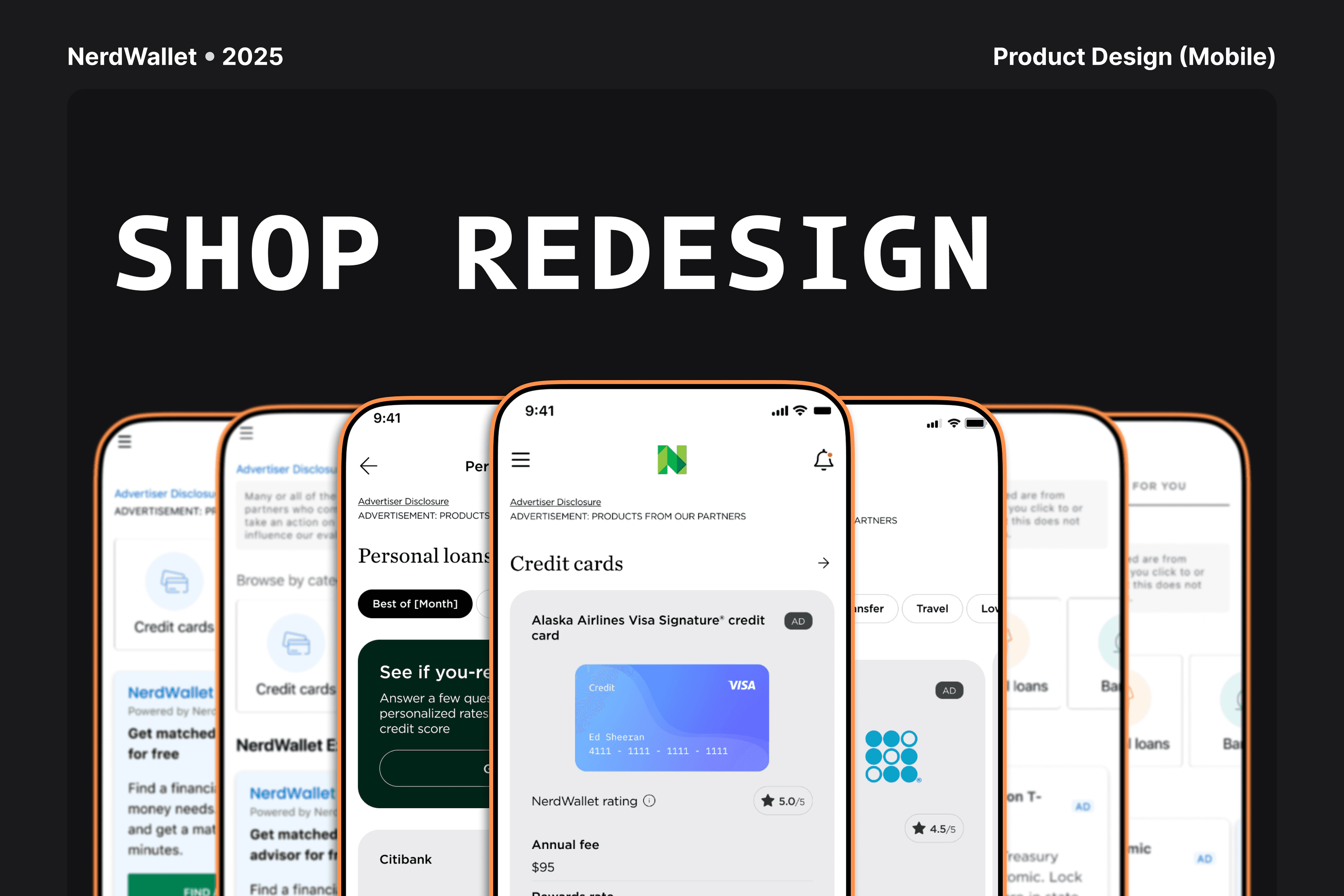
NerdWallet's Shop is the in-app marketplace where users discover and apply for financial products, like credit cards, banking accounts, mortgages, and insurance. I led the full Shop redesign across multiple releases: documenting the baseline at 13.5.0, iterating through incremental improvements from 13.6.0 to 13.9.0, and delivering the complete redesign at 14.0.0 in September 2025, covering two page levels (L1 and L2), a full component library, and every product, loading, error, and empty state. Within five weeks of launch, the redesign drove a 2.7x increase in revenue per session ($0.85 to $2.35) and lifted weekly Shop revenue from about $12.5K to $34.2K, the highest level recorded in over 15 months of tracked data.
1. Problem Identified
NerdWallet's Shop is where the app's financial guidance turns into action. It's the marketplace where users move from understanding their options to actually applying for a credit card, opening a bank account, or exploring mortgage rates. As the product grew, so did the complexity of maintaining it: new product categories were added release by release, carousel patterns diverged by product type, filter interactions weren't consistent across sections, and the tile designs had been adjusted so many times they no longer read as a coherent system.
The problems were visible at two levels.
At L1, the shop home page, everything felt cluttered and unstructured. Credit cards, banking products, loans, and insurance competed for attention at the same visual weight. Product carousels, both for listings and for banking products, had been designed separately and looked like siblings who grew up in different households. Loading, error, and empty states were handled differently in each section.
At L2, the product listing pages, users landing on a category page (credit cards, home equity, or financial accounts) encountered inconsistent headers, filters buried below the fold, and product tiles using three different layouts depending on when that page had been built.
The trigger for the redesign was strategic, not reactive: before NerdWallet could expand the number of products and partners in the Shop, the surface needed a coherent foundation that could scale without constant engineering rework.
"The Shop needs to feel like one product, not like ten teams each built their section and hoped it would hold together."
2. Briefing
The briefing process involved product, engineering, design system, and marketing. The release timeline was fixed: incremental improvements through 13.5.0 to 13.9.0, with the full redesign shipping at 14.0.0. My scope covered both page levels, the full component library, and every state.
The key design requirements looked like this. Two page levels were in scope, L1 (shop home) and L2 (product listing), each with its own component set and interaction model. The product types in scope were credit cards (CC), banking products, and financial services and loans (FL). The required components included product tiles, a product carousel spanning credit card, banking, and personal loan listings, pill filters, a full filter panel, product tile tooltips, a full-screen product detail modal, and advertiser disclosure. Full state coverage was required: every component needed documented loading (skeleton), error, and empty states, since the "happy path" was meant to be the last thing designed, not the first. The design had to be token and variable based, built on Figma Variables with multiple modes (Mode 1, White, Light) to support NerdWallet's theming system and component variants across contexts. And advertiser disclosure, a compliance component for promoted and sponsored products, had to be architecturally integrated into L1 from the start, not retrofitted later.
The design system dependency was the most complex coordination requirement on the project: any new component I introduced had to either use existing tokens or propose new ones through the design system team. Both paths required sign-off before production design could move forward.
3. Ideation & Brainstorming
I opened this phase with two brainstorming sessions alongside the product team, aimed at understanding the existing pain points in the Shop and generating solution ideas together. Those conversations aligned our understanding of where the experience was falling short and made room for hypotheses that only surface when design and product think together from the start.
Before any visual exploration work, I also ran a full audit of the Shop at 13.5.0, categorizing every distinct pattern in use, mapping each one to design system tokens (or flagging where it wasn't using the token system at all), and identifying which components were generating the most engineering maintenance burden.
Together, the brainstorming sessions and the audit surfaced four core problems to solve.
The first was that L1 had no visual hierarchy: content competed at the same weight regardless of importance. A clear reading order needed to be established, moving through navigation, featured offers, product discovery, and secondary content in sequence. That's where the "Minimal UI Shop" concept came from, a more restrained, deliberately uncluttered home page that let the products breathe.
The second was that tile design was fragmented: credit card tiles, banking tiles, and loan tiles each had different layouts. A unified tile system was needed that could adapt to product type while sharing a visual language, and it also had to carry a consistent way to flag sponsored placements, an AdBug, without turning the tile itself into a disclosure surface.
The third was that carousels had become component-per-team: each team that shipped a carousel had built its own version slightly differently. What was clearly needed was one canonical carousel component, applied consistently across credit cards, banking, and personal loans instead of rebuilt per category, with a shared swipeable card row and category-specific content underneath.
The fourth was that filters were page-specific: the L2 filter experience wasn't consistent across credit cards, home equity, and financial accounts. Pill filters, horizontal scrollable chips for quick filtering, didn't exist on every page, and the full filter panel had inconsistent behavior. We needed a unified filter system covering both the quick-filter (pill) and deep-filter (panel) use cases.
I also explored how other financial comparison platforms (Credit Karma, Bankrate) and non-financial product discovery apps (Airbnb, Duolingo's shop, Apple's App Store) handled hierarchy, progressive disclosure, and filter UX. The key insight came from the non-financial references: less choice paralysis at the top of the funnel led to better engagement deeper in the listing.
4. Lo-Fi Designs & Continuous Validation with Product
With the core problems mapped, I moved into lo-fi designs for the two highest-risk screens: the L1 page hierarchy (specifically the Minimal UI Shop concept) and the L2 filter interaction model (specifically the pill filter hypothesis). I validated each iteration continuously with the product team, reviewing together before moving on to any major visual refinement.
It was during this phase that we identified that the product tile would need a much bigger design effort than initially expected. On its own, the component carried a large share of the Shop's complexity: it had to support multiple product types, sponsored/AdBug states, and content variations, all while staying visually consistent. Given that, we decided to spin up a dedicated workstream just for product tiles, which eventually became its own project in my portfolio. You can see the full breakdown of that process here: Product Tiles: the Shop's component system.
5. Flow Refinement & Testing on Lyssna
With the lo-fis validated internally, I tested the highest-risk decisions with real users using Lyssna, a remote research platform that runs usability tests, first-click tests, and A/B tests directly against prototypes without needing to schedule moderated sessions one by one. The tool collects responses from a panel of participants and returns quantitative metrics, like task time, success rate, and preference, along with screen recordings, which made it possible to validate design hypotheses in days instead of weeks.
Testing was coordinated with the UX research team and mostly structured as A/B tests, comparing variations of screens, flows, and product tiles to settle each direction with data rather than opinion alone.
At L1, the testing goals were to check whether users could locate their intended product type within 10 seconds on the redesigned L1, to understand whether the Minimal UI approach felt authoritative or empty and whether users felt confident they were seeing relevant products for them, and to observe how they interacted with the product carousels across categories, looking at swipe behavior, entry rate, and scroll-stop behavior.
At L2, the testing goals were to check whether pill filters reduced time-to-filter compared with the panel-only experience, to understand whether users grasped the pill filter and full filter panel relationship without explicit instruction, and to evaluate whether product tile tooltips helped users compare products or interrupted the browsing flow.
Among the key findings, at L1 the redesigned hierarchy tested significantly better for wayfinding. Separating credit card products (in the product tile grid) from banking products (in the carousel) removed the most common point of confusion in the existing experience. Also at L1, "Minimal UI" was well received by users with moderate browsing intent: high-intent users appreciated the reduced noise, while users in discovery mode wanted more entry points into specific categories. That tension is part of why the L2 pill filters, already scoped from the start of the project, needed to make quick category access effortless the moment a user left L1 for a listing page. Still at L1, the carousels showed strong swipe engagement across categories: users who stopped at a carousel without a specific product in mind engaged more deeply than users who arrived with a pre-defined goal, a counter-intuitive finding that shaped how products were sequenced within each category's carousel.
At L2, pill filters reduced filter task completion time significantly, and the persistent filter icon in the top-right corner was used confidently by users without any instruction, even though it sat outside the pill row itself. Product tile tooltips, meanwhile, proved valuable for credit card comparison (APR, annual fee, rewards) but felt intrusive on banking product tiles, where users preferred navigating straight to the full detail page.
6. L1 & L2 Changes
Based on the testing results, I revised both levels before moving into hi-fi.
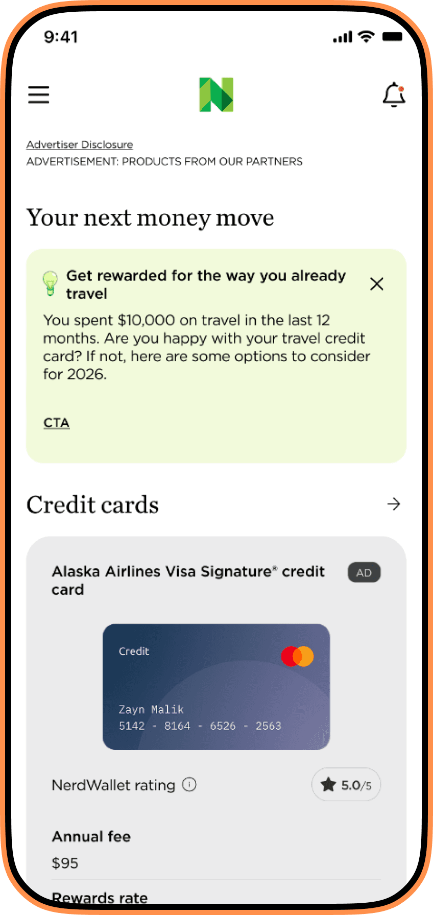
At L1, I confirmed Minimal UI Shop as originally scoped: a restrained, single-scroll home page, with no tab switch and no pill filter row, since quick category access was already planned to live at L2, not L1. I standardized advertiser disclosure as a single, minimal component pinned to the top of the page, replacing the old buried legal block, and gave sponsored tiles their own compact AdBug indicator so sponsorship stayed legible tile by tile without turning disclosure itself into a per-tile element. I also built a unified tile system with three product-type variants: the Credit Cards tile (with card art and key attributes like APR, annual fee, and rewards category), the Banking tile (financial products, with an icon and key metrics), and the Personal Loans tile (loan amount, term, and key attributes). All three share the same spacing tokens, typography scale, and state behavior.
I also consolidated what had been a carousel built separately by each product team into a single carousel component, applied consistently across credit cards, banking, and personal loans: swipeable cards with a next-item preview and scroll-snap, with each category adapting its own key attributes, APR and rewards for credit cards, APY and minimum balance for banking, loan amount and term for personal loans, inside the same card anatomy and interaction model. I also moved category browsing that used to live in a carousel mid-page into "Explore more categories," a dedicated grid of cards in the page footer, so it read as secondary to the curated carousel and tile grid above it. And before moving into hi-fi screens, I built a complete state map covering every L1 component: loading skeleton, connection error with retry, and empty state with CTA. Designing the states before the default screens forced real-data thinking early.
At L2, I made pill filters the primary quick-filter surface: a horizontal scrollable chip row with the most commonly used filters per product type. CC L2 chips cover card type, rewards category, and credit score range. Banking L2 chips cover account type, minimum balance, and APY range. The full filter panel stayed reachable through a persistent filter icon in the top-right corner of the page, always visible above the pill row rather than buried in a separate menu. The panel also got a visual overhaul, with clear section headers, multi-select checkboxes, a count badge showing the number of active filters, and a persistent "Apply" CTA.
I standardized the header across L2 types, with three named variants: default (title only), with subtitle (category description), and with category indicator (breadcrumb), applied consistently across CC L2, Banking L2, and FL L2. I scoped product tile tooltips to CC, since testing confirmed their value for credit card comparison and showed they got in the way on banking product tiles; the CC tooltip shows APR, annual fee, and primary rewards category. And I added a full-screen product detail modal, triggered when a user taps "More details" on a tile without leaving L2, showing the product's key attributes and a CTA, so users can either continue to the full product detail page or close the modal and keep browsing. The modal has multiple states: loading, loaded, and unavailable.
7. Component Deep Dives: Isolating What Was Actually Broken
One thing that shaped this project from very early on was refusing to treat the Shop as a single composition to redesign end to end. Four pieces carried most of the accumulated debt on their own, and each one needed to be pulled out, tested, and rebuilt as its own decision before it went back into the page. This section walks through four of them: navigation, advertiser disclosure, the product tile carousels, and ads, plus how the old "explore more" links became footer cards.
Navigation: From a Three-Way Tab Test to One Scrollable Page
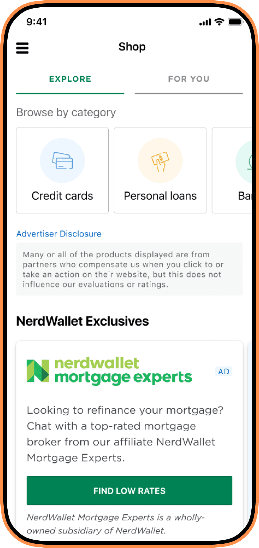
At 13.5.0, the shop home page still lived behind tabs. I ran the first A/B/C test on this: an "Explore" tab built around browsing by category, a "For You" tab built around a personalized feed, and a variant of "For You" with pagination dots on its top carousel, to see if users noticed there was more to scroll through. Alongside that, two smaller tests ran in parallel: one on how credit card and banking products should be composed together on the home tab, and one on the call-to-action copy for personal loans. None of the three navigation variants won decisively on its own, but the data pointed at something the tabs themselves were hiding: users didn't reliably know which tab held the product they wanted, so they split attention across both instead of committing to one. That finding is what killed the tab model outright. By 14.0.0, Minimal UI Shop replaced all three variants with a single full-height scroll: one hierarchy, one page, where the unified product carousel and tile grid did the work the tabs used to split across "Explore" and "For You," so users no longer had to guess which mode held the product they wanted before they could start browsing.
Advertiser Disclosure: From a Buried Legal Block to a Standardized Top-of-Page Component
At 13.5.0, advertiser disclosure lived as its own standalone block dropped into the middle of the page: a wall of legal copy under a generic "Advertiser Disclosure" heading, disconnected from any specific product and easy to scroll past without reading. It satisfied compliance but told users nothing about which tiles on the page were actually sponsored. The redesign turned disclosure into a single, minimal component pinned to the top of every Shop page, L1 and L2 alike, so it's the first thing a user sees on any given screen rather than something buried mid-scroll. Sponsored tiles carry their own compact AdBug indicator directly on the tile, a separate, tile-level signal that a given listing is a paid placement, distinct from the page-level disclosure text above it. Splitting the two, one consistent disclosure component at the top of the page and a lightweight badge on the tile, meant compliance language stayed centralized in one place instead of repeated per tile, while users still got a clear, per-tile cue about sponsorship.
Product Tile Carousels: From One Carousel Per Team to One Shared Component
The 13.5.0 audit found a carousel for credit cards, a separate one for banking, another for personal loans, and a "recently viewed" rail, each built by whichever team shipped it first and each behaving slightly differently: different card widths, different scroll physics, different rules for what counted as a "sponsored" slot. The redesign collapsed all of that into a single carousel component, used consistently across credit cards, banking, and personal loans instead of being rebuilt per category. Every instance shares the same swipeable-card interaction, next-item preview, and scroll-snap behavior; what changes by category is the content inside the card, NerdWallet Rating, annual fee, intro APR, and a recommended credit score range for credit cards, APY and minimum balance for banking, loan amount and term for personal loans, with sponsored slots marked by the same AdBug used on tiles elsewhere in the Shop. Keeping this as one shared component instead of a bespoke build per product team is one of the decisions that held up through engineering and QA, detailed in section 9 below.
Ads: From an Inline Tag to a Designed Placement
Sponsored content showed up in two different places in the old Shop, and neither was designed as its own thing. Product tiles had an ad label bolted onto the corner when a listing was sponsored, and separately, promotional units for NerdWallet's own services, like financial advisor matching or mortgage brokers, were dropped into the feed using whatever layout was fastest to ship. The redesign treated both as first-class components and kept them in the same two places rather than adding a third. Inline sponsorship stayed on the tile as a standardized AdBug, the same one used across the product carousel and the tile grid. Ads for NerdWallet's own products got their own component family, placed between carousels rather than mixed into them: NerdWallet Advisors Match ("Match with a financial advisor for free") and NerdWallet Mortgage Experts ("Find low rates") each ship as a fully designed card with its own headline, CTA, and disclosure footer, visually distinct from the product carousels and tile grid around them so users can tell at a glance they're looking at a NerdWallet promotion rather than a ranked product result.
Explore More: From a Carousel to a Footer Card Grid
At 13.5.0, categories that didn't fit into the credit cards, banking, or personal loans carousels, things like insurance, mortgage, and small business loans, lived inside their own carousel embedded mid-page, given no more visual weight than any other row of content on the screen. It worked, but it read as an afterthought wedged into the scroll rather than a deliberate way to browse everything the Shop offered. In the redesign, that carousel moved out of the page body entirely and became "Explore more categories": a grid of icon-led cards (Mortgage, Small Business, Student Loans, Online Brokers, Life Insurance, Auto Loans, Auto Insurance, Banking, Personal Loans, Credit Cards) placed at the very end of the page, after the carousel and the tile grid. Moving it to the footer and giving each category its own card did two things at once: it matched the visual weight of the component to its actual place in the page hierarchy, secondary to the curated carousel above it, and it turned a scan-and-skip list into something that looked worth tapping.
8. Hi-Fi Design & Handoff
The full hi-fi was organized into clearly named sections inside the design file, built to ship with the 14.0.0 release.
At L1, Minimal UI Shop became the new shop home: a full-height scrollable screen showing NerdWallet's product marketplace, with a navigation bar and section header, the product carousel with credit card, banking, and personal loan listings as swipeable cards, and the product tile grid with credit card, banking, and personal loan tiles. Advertiser Disclosure shipped as a single, standardized component pinned to the top of the page, with sponsored tiles carrying their own compact AdBug. Tiles became a unified component with three product-type variants (Credit Cards, Banking, Personal Loans) and four states: default, pressed, loading, and unavailable. Product tile tooltips got two positioning variants, one triggered from L1 and pointing toward L2, and another triggered within L2 itself, as a contextual comparison view. The product carousel shipped with default, loading (skeleton per card), error (inline with retry), and empty variants, consistent across its credit cards, banking, and personal loans sections. Finally, all of L1 got full state coverage for loading, error, and empty, including light-mode variants for white-background contexts: skeleton loader, connection error, empty shop, and partial load.
At L2, I defined three named page types, CC L2 (credit cards), FL L2 (financial services and loans), and Banking (banking accounts), each with full-page designs for default, filtered, and empty states. The header became a standardized component with three variants: default, with subtitle, and with category indicator. Advertiser Disclosure carried over from L1 as the same standardized component pinned to the top of the page. Pill Filters form a horizontal scrollable chip row, with default, active, and disabled chip states, and variants specific to CC L2 and Banking L2, since each product type has its own filter taxonomy; the full filter panel opens from a persistent icon at the top right of the page rather than from the pill row itself. The product detail modal, triggered by "More details" on a tile, shipped with loading, loaded, and unavailable states. The full filter panel got sections per product type and "Clear all" and "Apply" actions with an active filter count badge. And the Product Details page became directly accessible from L2, with the full product detail page design.
At handoff, I delivered the Figma file to engineering organized by section, with specs for every state (loading, error, empty, and default) and behavior annotations for the components with more complex logic, like the product carousel and the product detail modal. I also kept working sessions going with engineering throughout implementation, to resolve interpretation questions before they turned into production inconsistencies.
9. Results & Learnings
The 14.0.0 redesign launched in September 2025 and produced immediate, measurable results, tracked weekly through NerdWallet's internal Shop performance dashboard.
Within five weeks of launch, revenue per session jumped from $0.85 to $2.35, a 176% increase. Monetizable clicks (mClicks) per session went from 0.053 to 0.156, up 194%. Product impressions per session rose from 5.4 to 8.1, up 50%. And weekly Shop tab revenue jumped from about $12.5K to $34.2K, up 174% and the highest level recorded in over 15 months of tracked data. Traffic held steady throughout: app-wide weekly screen views stayed at 450K or more, confirming the redesign improved engagement without cannibalizing overall session volume or causing bounce rate regression.
The data team's own summary captured the dynamic cleanly: traffic to the L1 page was unaffected by the changes, but L1 became one of the most revenue-impacted surfaces post-launch. In other words, the redesign didn't bring more users to the Shop, it made the Shop work harder for the users already there. And the most meaningful signal of all was the jump in mClicks per session (194%) far outpacing the jump in impressions per session (50%). That means the improvement wasn't just about showing more products, it was about showing the right products in a layout that made users more likely to act. The unified tile system, the consolidated product carousel, and the pill filter redesign together improved the signal-to-noise ratio of the entire product discovery experience.
What landed well: consolidating what used to be a carousel built separately by every product team into one shared component, adapted by category (credit cards, banking, personal loans) instead of duplicated per team, was a decision that held up through engineering and QA. There was pressure early on to let each team keep maintaining its own version, but the audit and, ultimately, the shared component itself proved unification was worth the coordination cost: one place to fix bugs, one loading/error/empty state spec, and category-specific content handled through variants instead of forked code. The state-first approach, designing loading, error, and empty states before default screens, also caught three product requirement gaps early. Questions that only surface when you design the empty state, like "what's the call-to-action when there are no credit cards available for this user's credit score?", forced earlier alignment with product and data teams.
What was harder than expected: the Advertiser Disclosure component turned into the most contentious negotiation of the whole project, not because the compliance requirement changed, but because legal wanted it bigger and more prominent than the minimal, top-of-page treatment I'd designed. Design's case was that a heavier disclosure block would undo the exact decluttering the rest of the redesign was built around; legal's case was that a compliance component nobody notices doesn't do its job. We went back and forth for several rounds before landing on a middle ground both sides could sign off on: a component prominent enough to register as unmissable at the top of the page, without reintroducing the wall of legal text that used to sit buried mid-scroll. Getting legal into the room earlier, at the briefing stage rather than mid-design, would have shortened that negotiation considerably.